ARTICLE TRANSMISSION PROJECT
THE MISSION
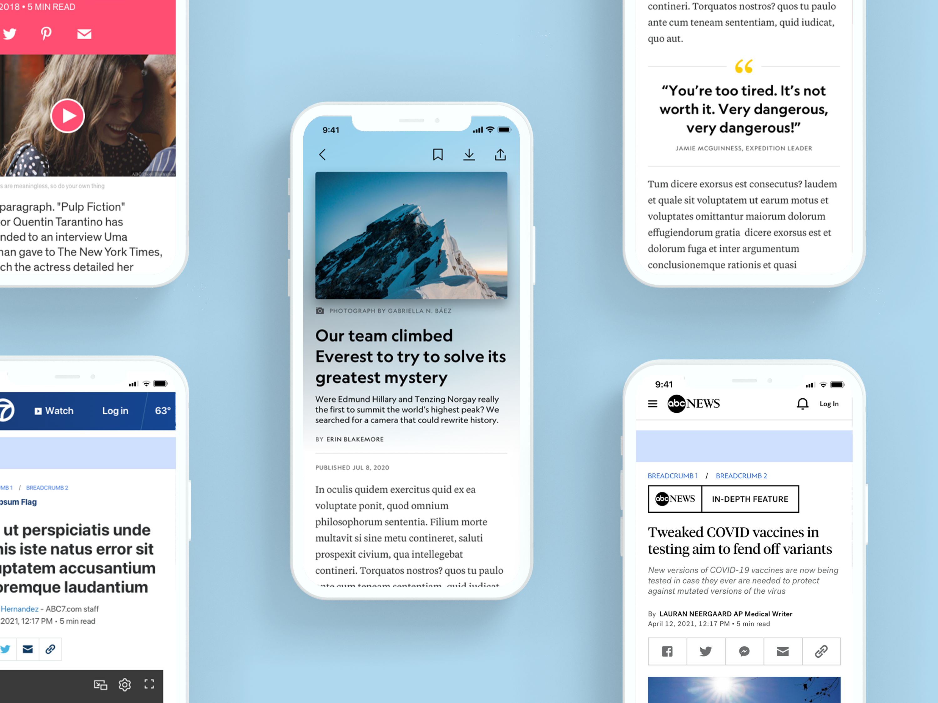
The scope of the article transmission project is to create a common article template that can be scaled to multiple websites across DMED's (Disney Media & Entertainment Distribution) diverse product portfolio.
Team
6 Designers (Dedicated Brands)
1 Product Director
Tools
Sketch
Abstract
InVision Freehand
Duration
6 Months + Ongoing
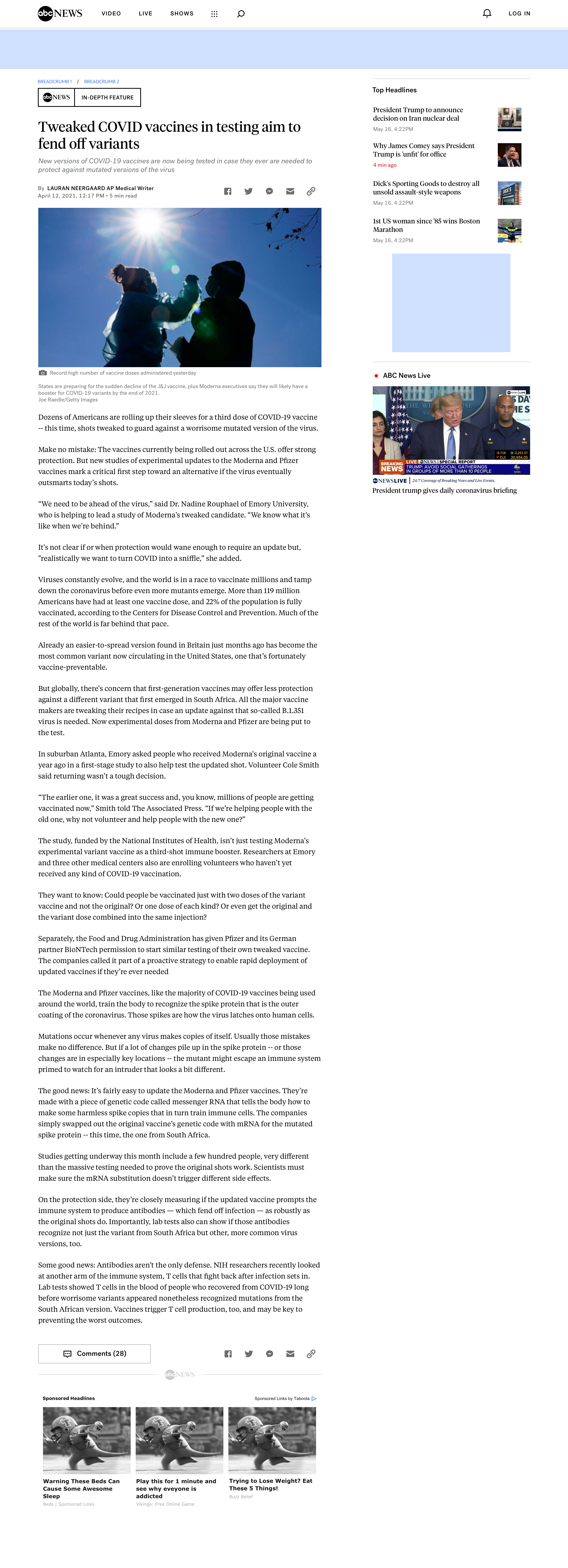
My role as one of the dedicated designers was to represent ABC News (National), ABC News OTV (Local Stations), and GMA. I contributed to the auditing of the current article temples for my brands, identifying the similarities and differences for the taxonomy chart, led design for certain components like image/videos and lead sections, and as well as stress testing the new designs for the three brands.
THE PROBLEM
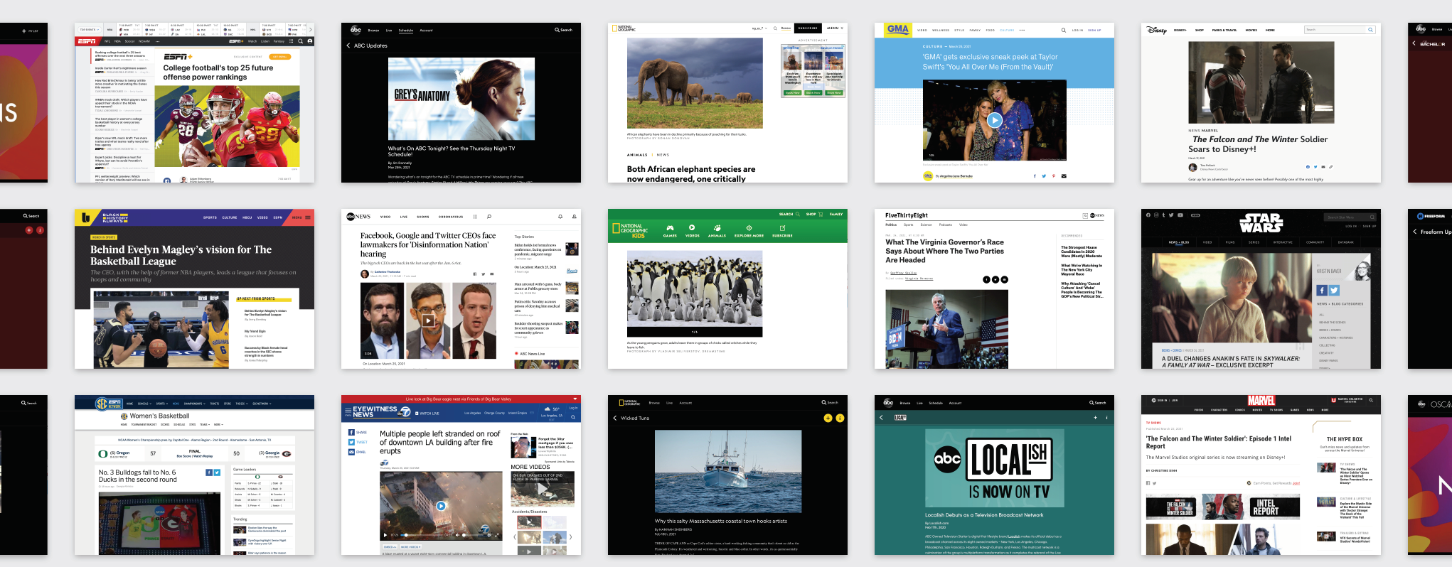
Each brand within Disney's diverse product portfolio has its own article template, which requires DMED Technology to support numerous frontend platforms in order to maintain or iterate on these templates.
CLIENT PLATFORM APPROACH
Our goal is to build a standard article template on the frontend web platform in a brand-agnostic way, that is maintained and iterated upon centrally by one team, but is differentiated broadly across the portfolio.
PROJECT GOAL
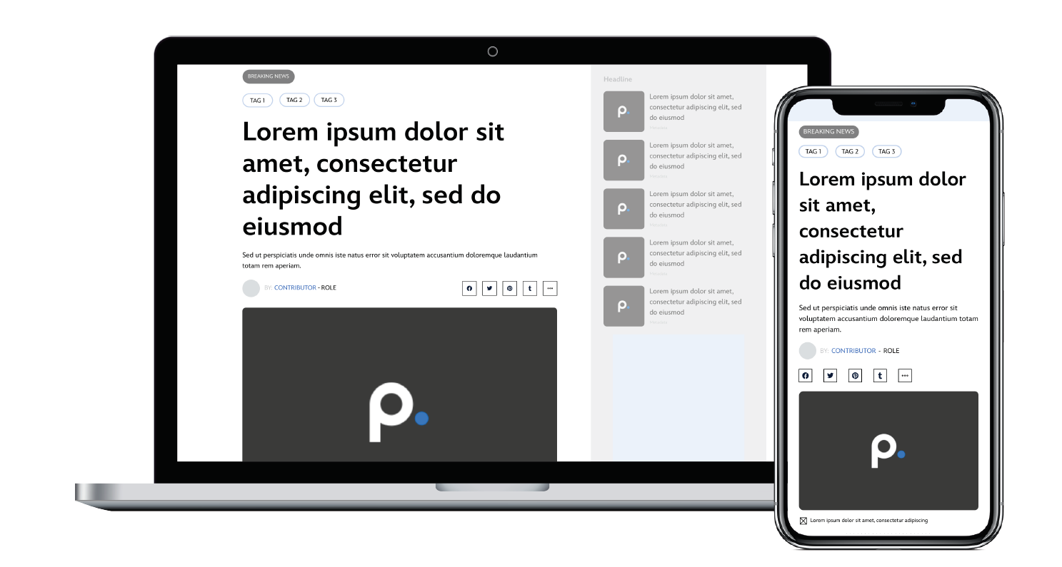
The team will deliver a base article template that each brand team (vertical) is able to customize with their own brand styles to meet the needs of their unique products.
PRISM (DMED'S DESIGN SYSTEM)
- Template will be in full alignment with the design standards established in the Prism design system
ROBUST
- At minimum, the template will contain all of the core components required for this experience.
- Over time, more advanced elements will be continuously introduced to the component library.
SCALABLE
- The template will be flexible enough to meet the unique needs of individual brands.
- Brands can make customizations to look and feel, layout, and monetization/acquisition elements based on their needs.
ACCESSIBLE
- The template will adhere to the WCAG 2.1 AA standard as a baseline. More rigorous standards are also kept in check.
- When brands adopt this template, they should expect accessibility to be a core feature of the platform.
PERFORMANCE
- Elements will be built in a way that supports a fast page load.
- Design and interaction enhancements will also contribute to an improved perceived performance.
PROJECT PHASE ONE
Auditing
The first phase is to audit all our previous brands' article templates. We want to understand what type of grid the previous article templates were using if the type ramp is aligned to Prism standards, and what needs to be changed before the stress test of each brand. We audited National Geographic mobile, National Geographic Web, ABCNews National, ABCNews Local, ESPN, and GMA for the first phase.
One example of a brand audit is the National Geographic mobile app. The app was redesigned based on Prism guidelines and therefore aligned very well with our new article template.
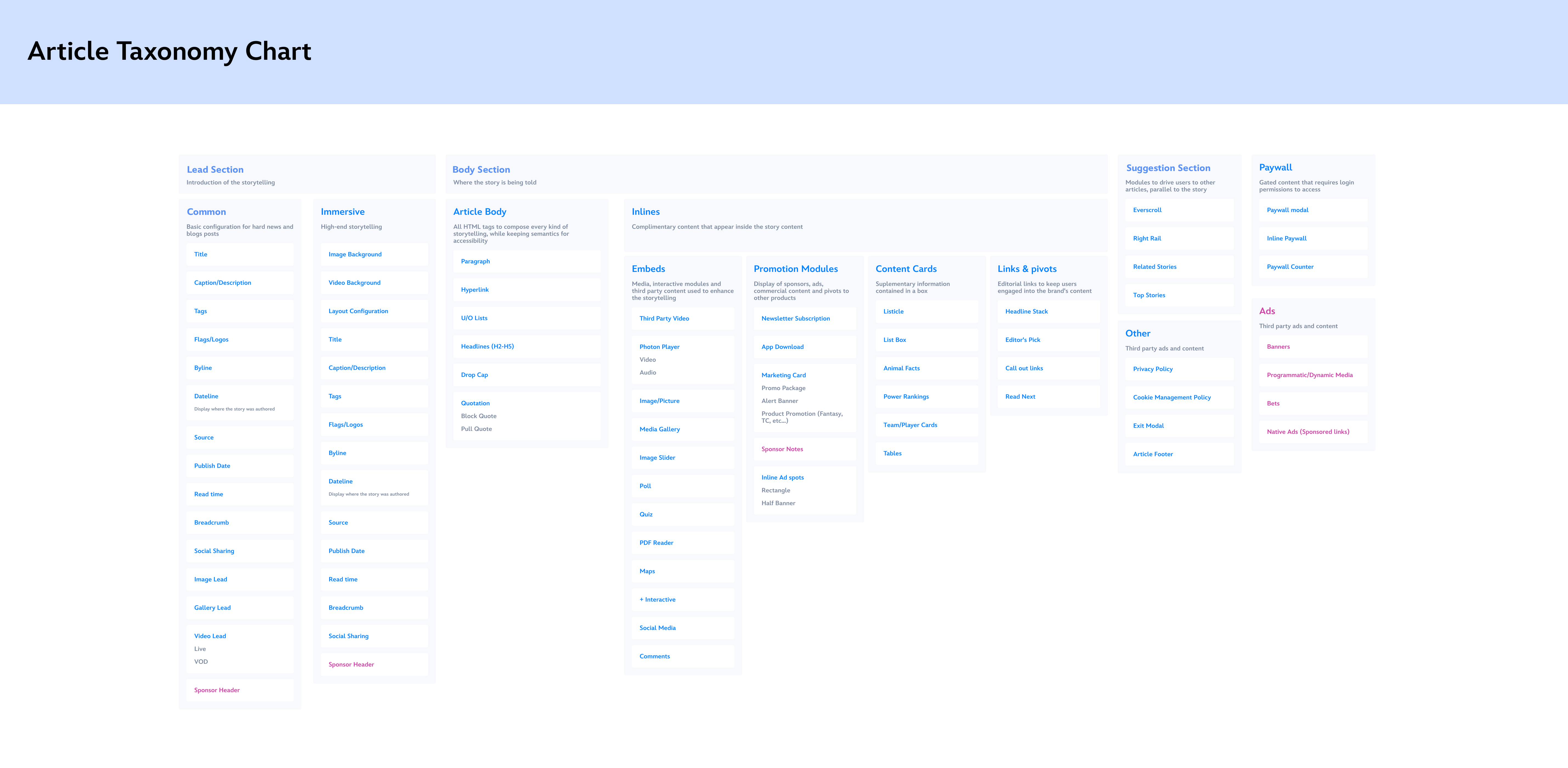
The next step of the project was identifying similarities and differences across each brand's article template. By doing so, we were able to compile together a chart of what features we want to include and implement to the article template moving forward. The next step was taking these findings and separating them into different sections and listing out specific components for each one.
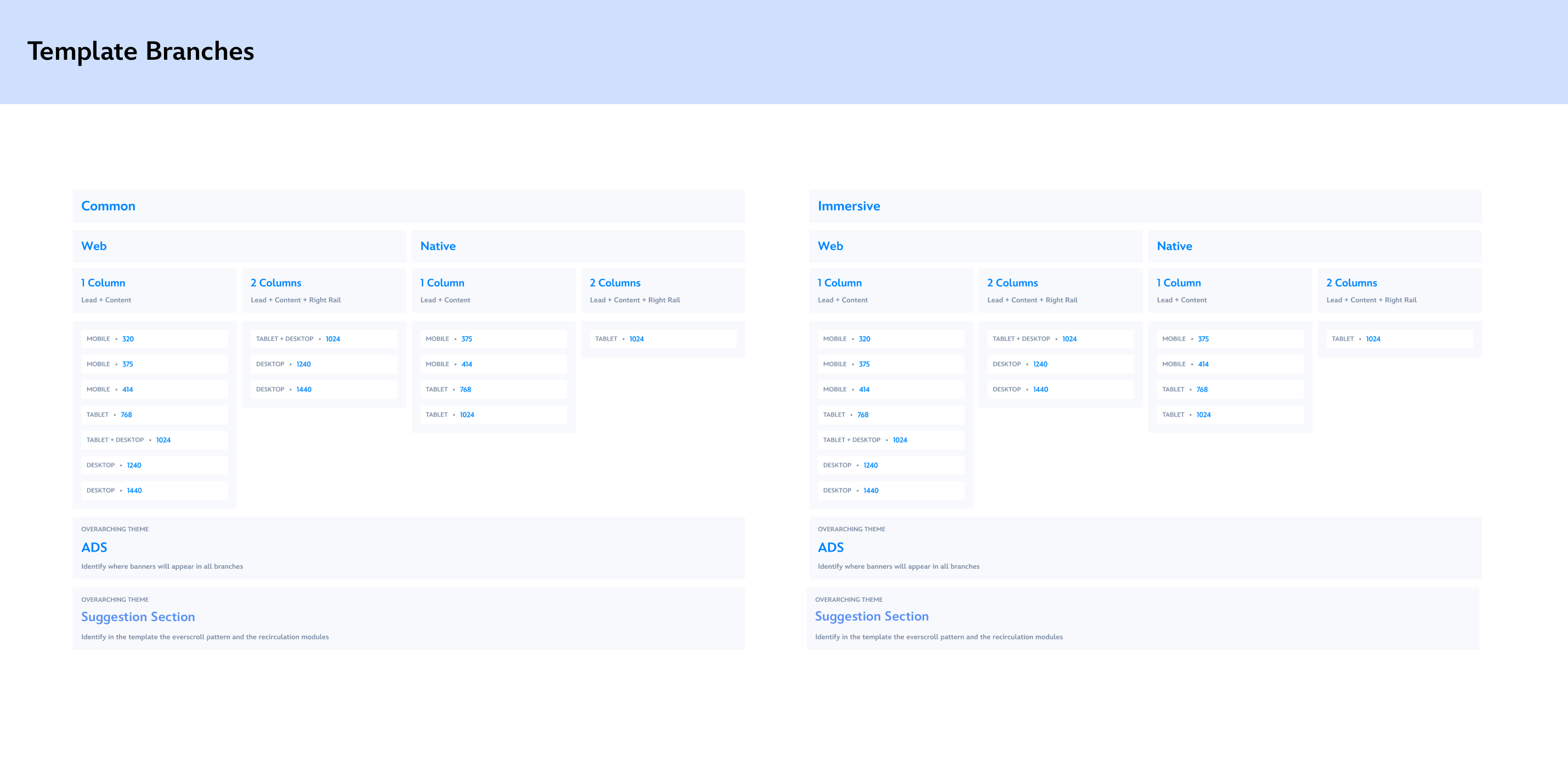
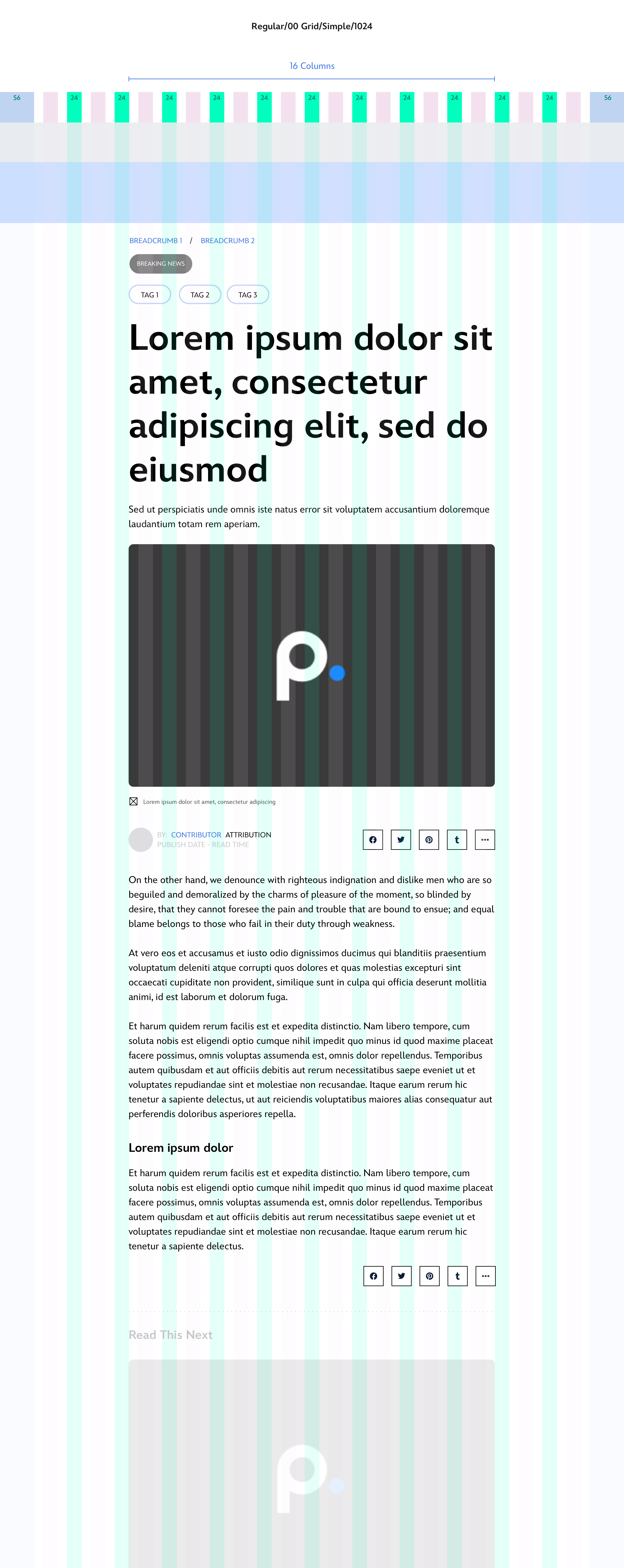
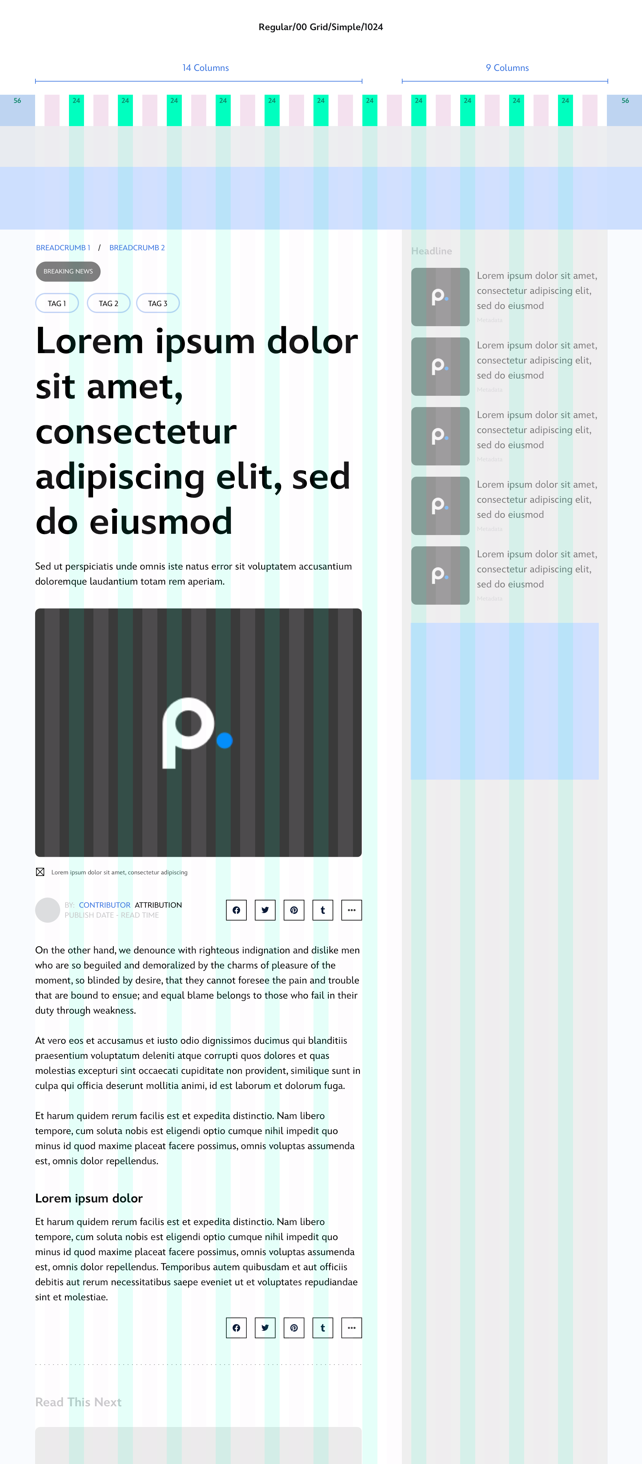
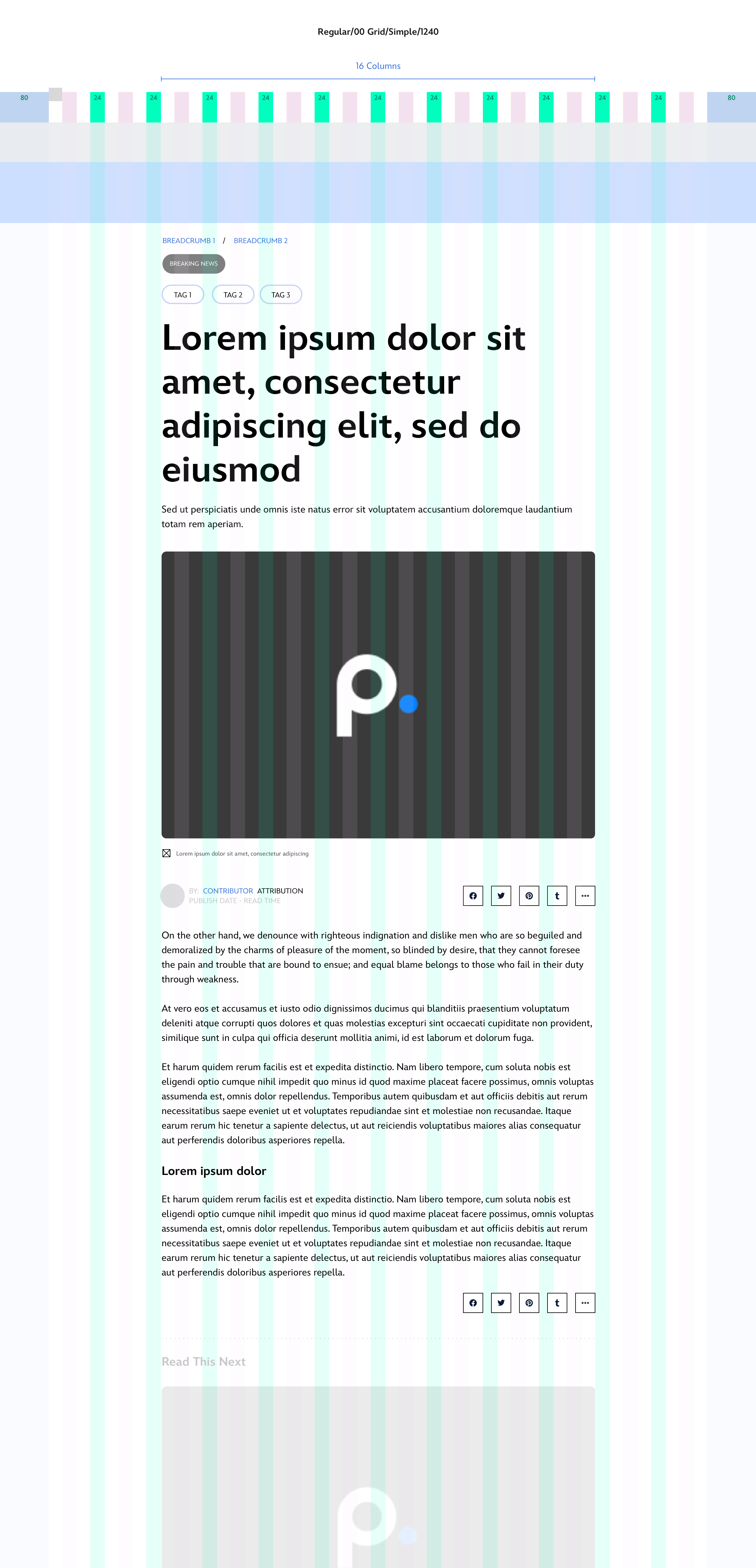
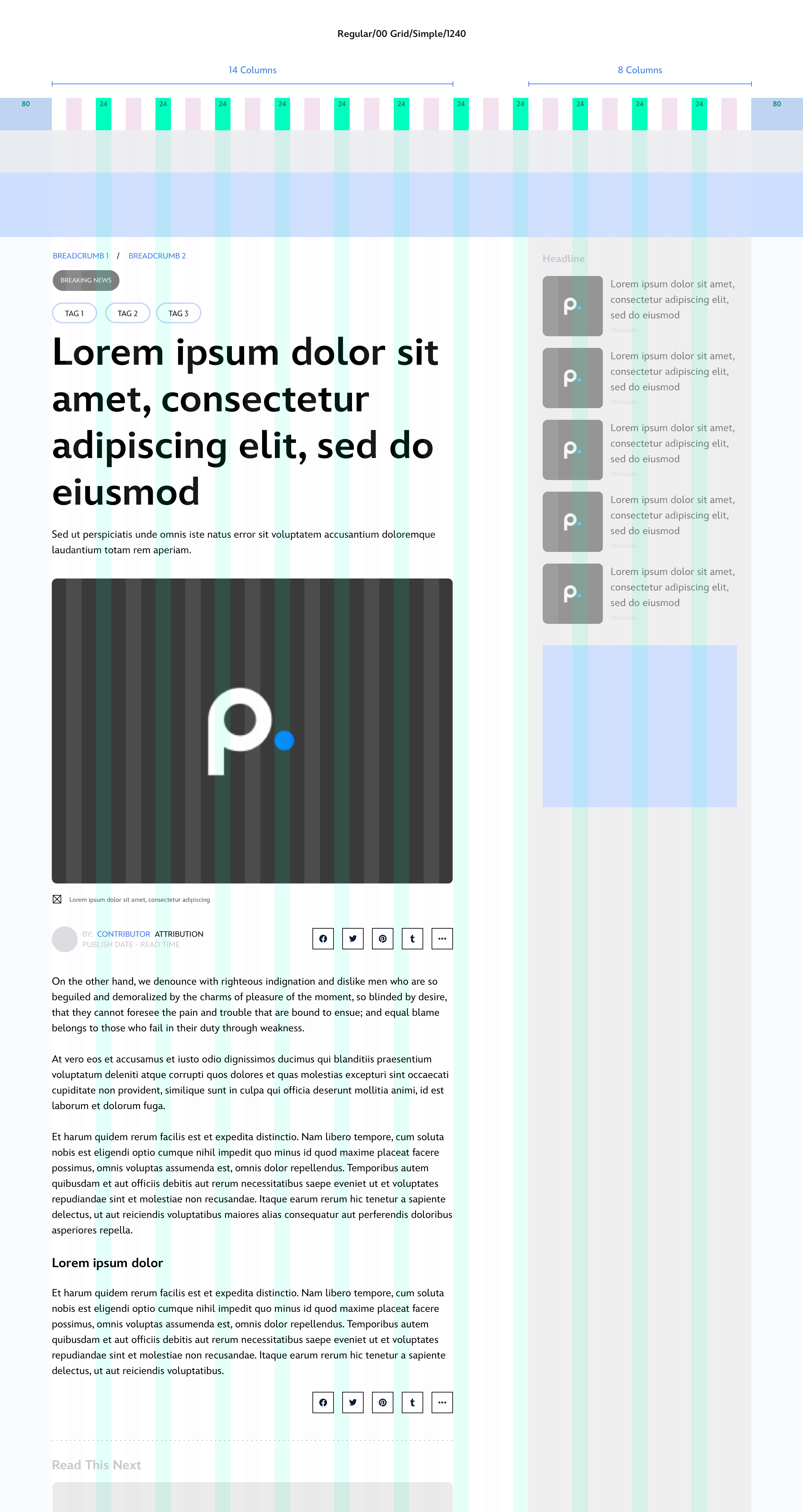
The next step was identifying the different breakpoints and designing for responsiveness. The templates are broken into two types of articles, common and immersive. The common template is meant for the day-to-day articles and common stories. While the immersive is for special features, promotions, and etc.
Following PRISM (Disney's newly integrated design system) guidelines, we laid out the foundation of the article template on different breakpoints. On larger breakpoints, we designed for single column and two column article pages. Each brands have their own use cases for which type of format they show to their users.
We still want to keep the storytelling and content that we provided users previously. Overall, the article content itself hasn't changed too much since we are taking the bases from previous brands. The article content should feel much more immersive and more aligned across the Disney brands.
For example, ABCNews article pages are strictly two column format, GMA article pages are both single and two column format, and National Geographic are two column format but may move over to single column to align with the newly redesigned Natgeo mobile app.
We also proposed a consistent type ramp to be used across the article pages. All the brands should follow the same type ramp for the article templates but do not have to follow the same size and font-weight.
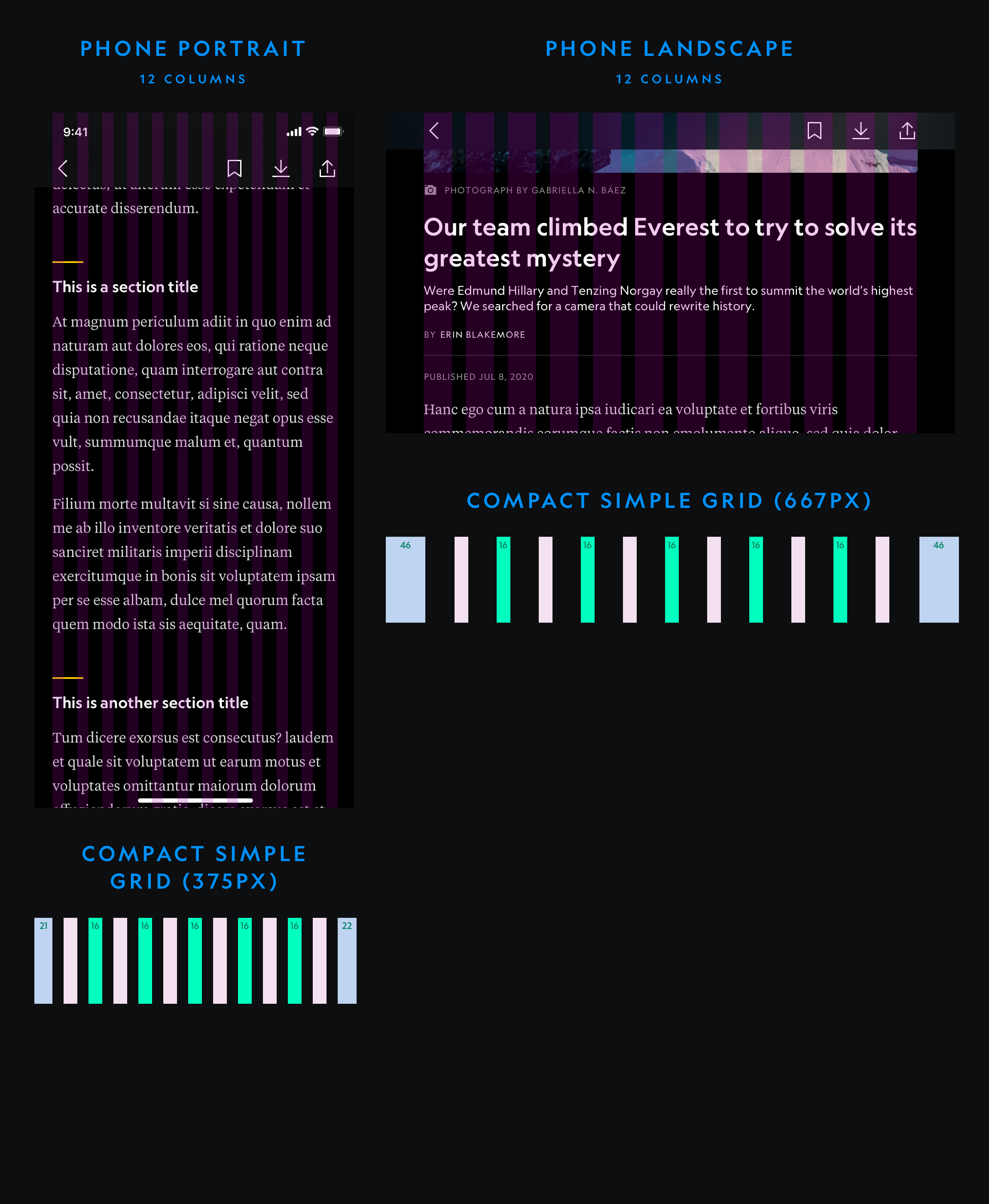
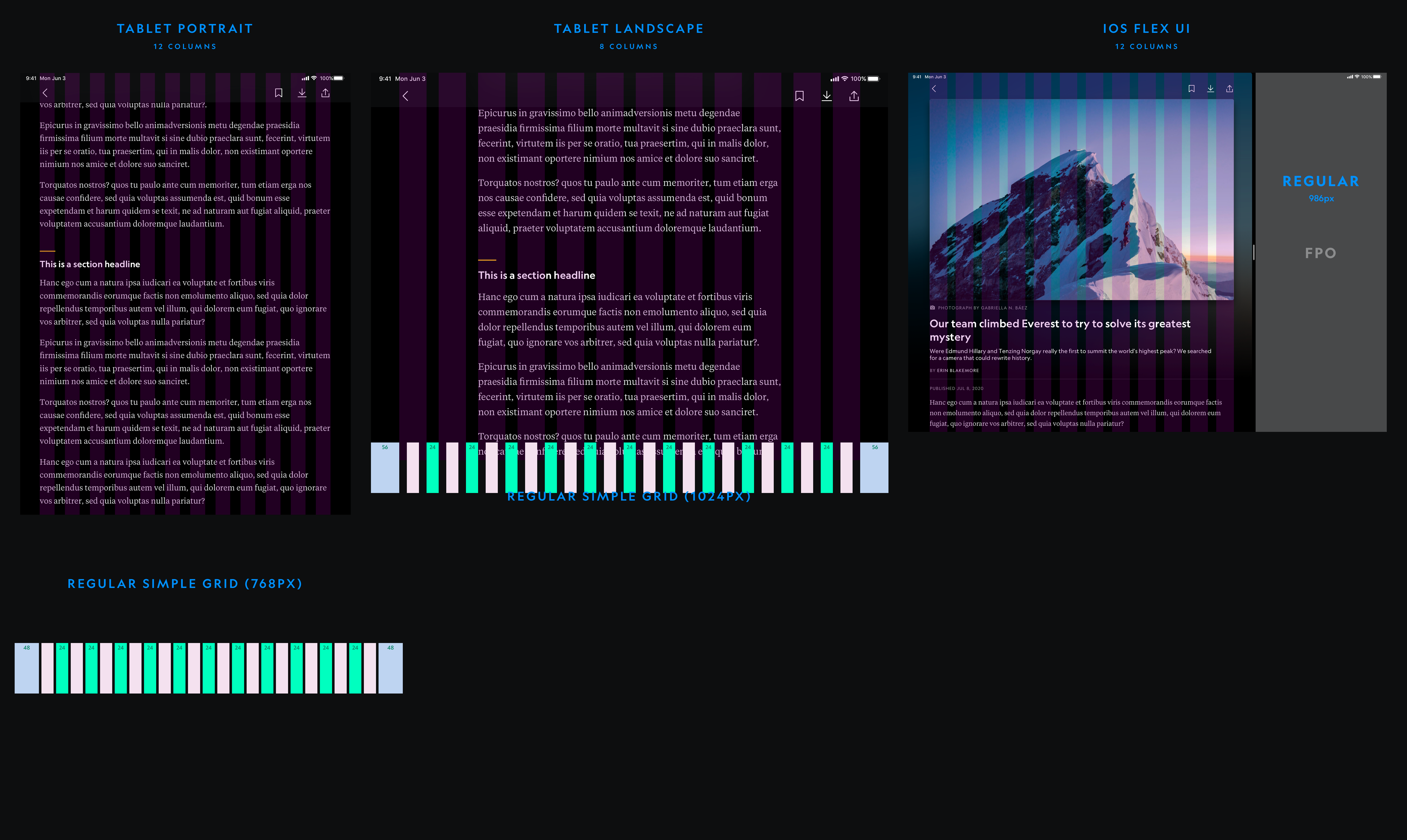
Compact: 320 and 375
Regular: 768


Regular: 1024 - 1 & 2 Columns, 1240 - 1 & 2 Columns
Regular: 1440 - 1 & 2 Columns
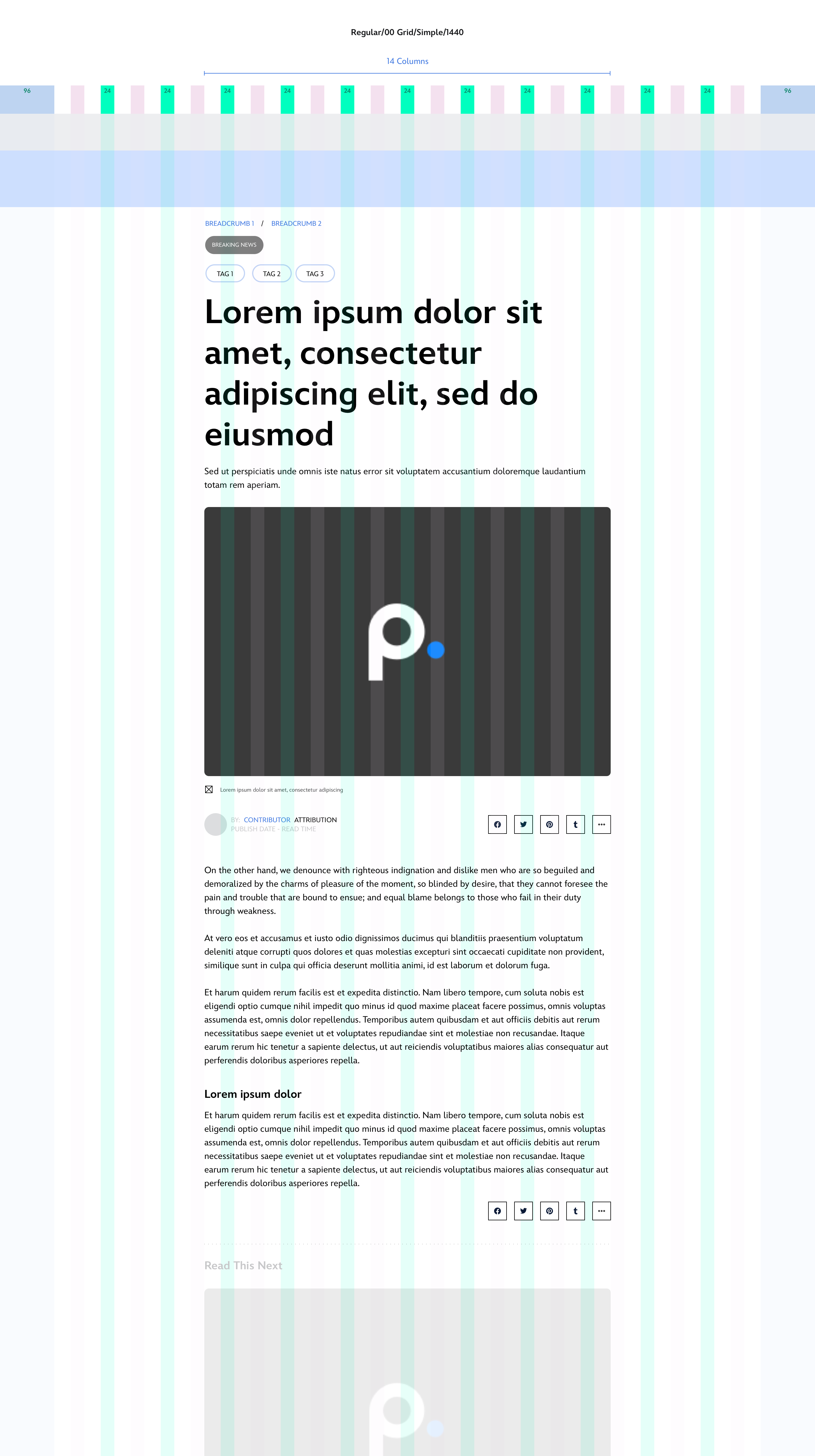
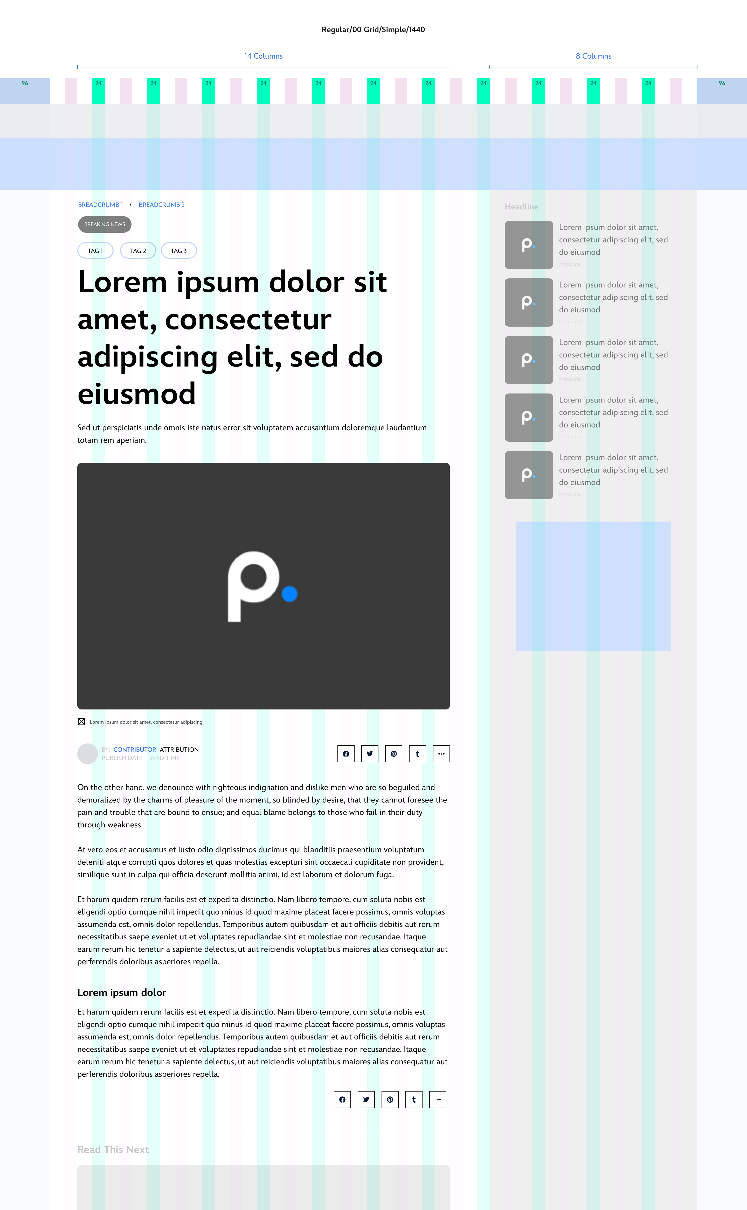
Lead Section
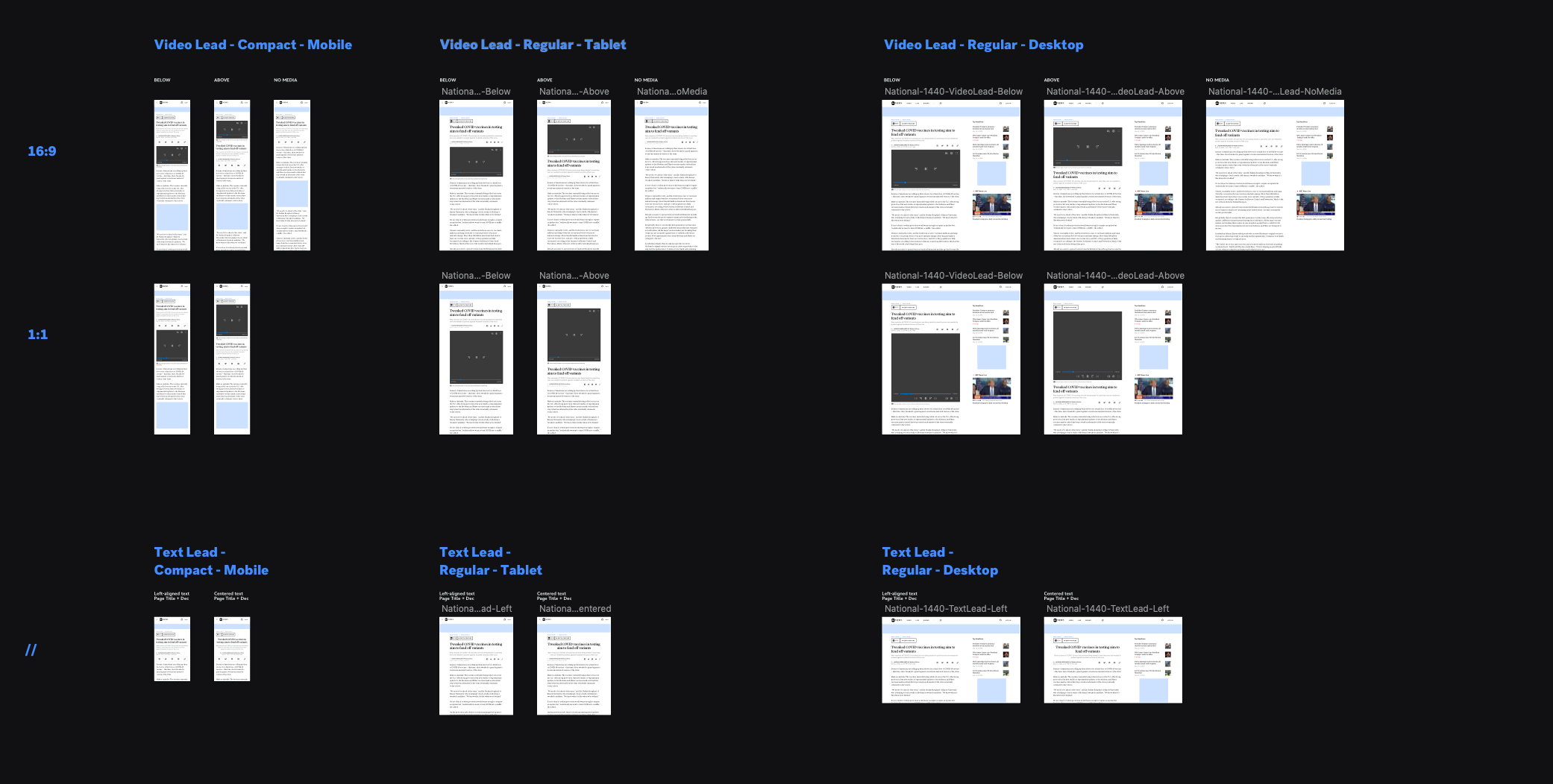
The lead section is the introduction of the storytelling. We want users to be captivated by the headlines, leading image, or leading video. We also implemented new designs for bylines, media credit, and social sharing icons.
This section includes:
Common
- Title, caption/description, tags, flags/logos, byline, dateline, source, publish date, read time, breadcrumb, social sharing, image lead, gallery lead, video lead, sponsor header
Immersive
- Image background, video background, layout configuration, title, caption/description, tags, flags/logos, byline, dateline, source, publish date, read time, breadcrumb, social sharing, sponsor header

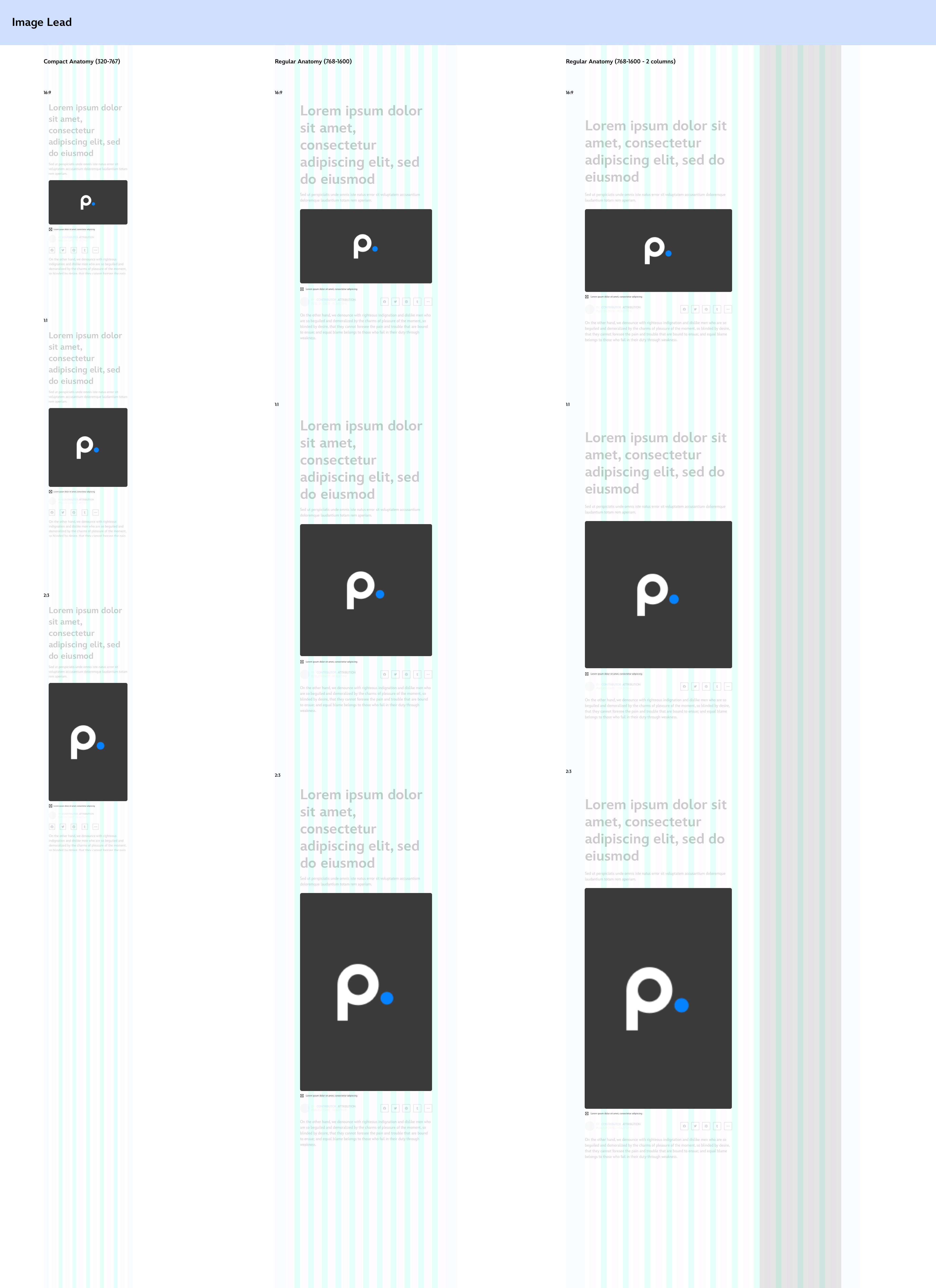
Body Section
The body section is where the story is being told. This section includes:
Article body
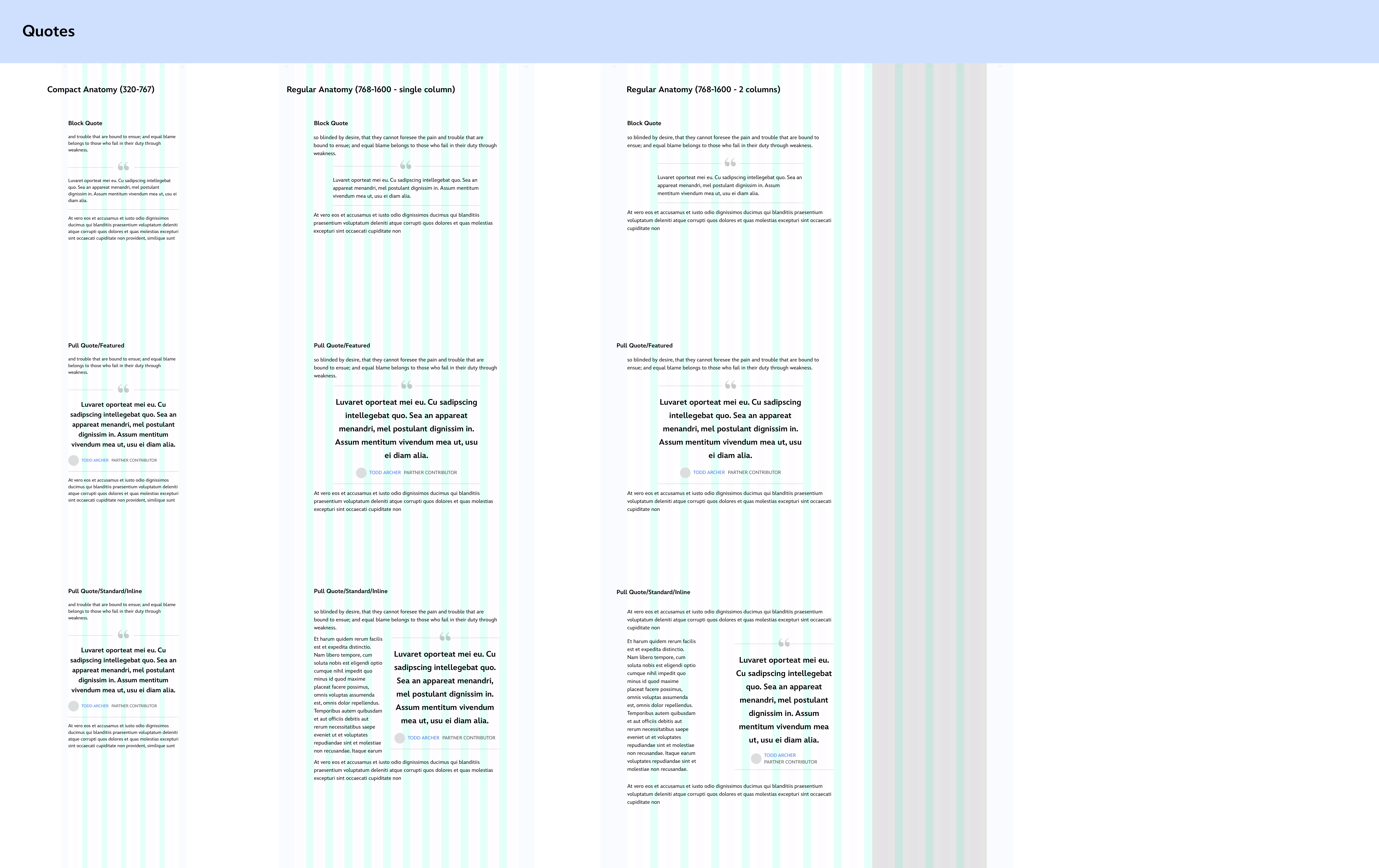
- Paragraph, hyperlink, lists, headlines, quotations
Inlines
- Embeds (third party video, video & audio player, images, media gallery, image slider, poll, quiz, pdf reader, maps, interactive, social media, comments)
- Promotion Modules (newsletter subscriptions, app download, marketing card, sponsor notes, inline ad spots)
- Content Cards (list, animal facts, power rankings, team/player cards, tablets)
- Links & pivots (headline stack, editor's pick, call out links, read next)
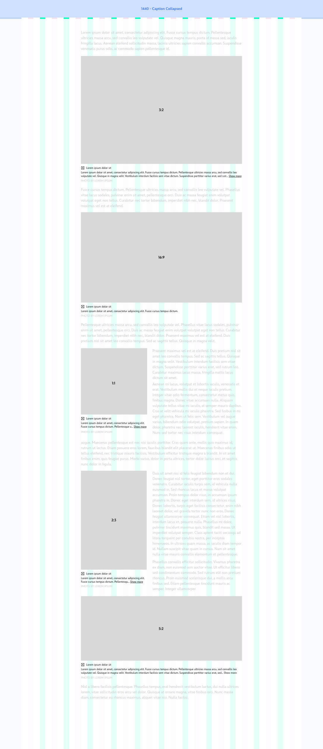
PROJECT PHASE TWO
Stress Testing
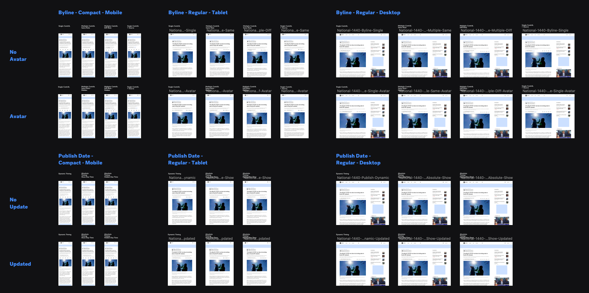
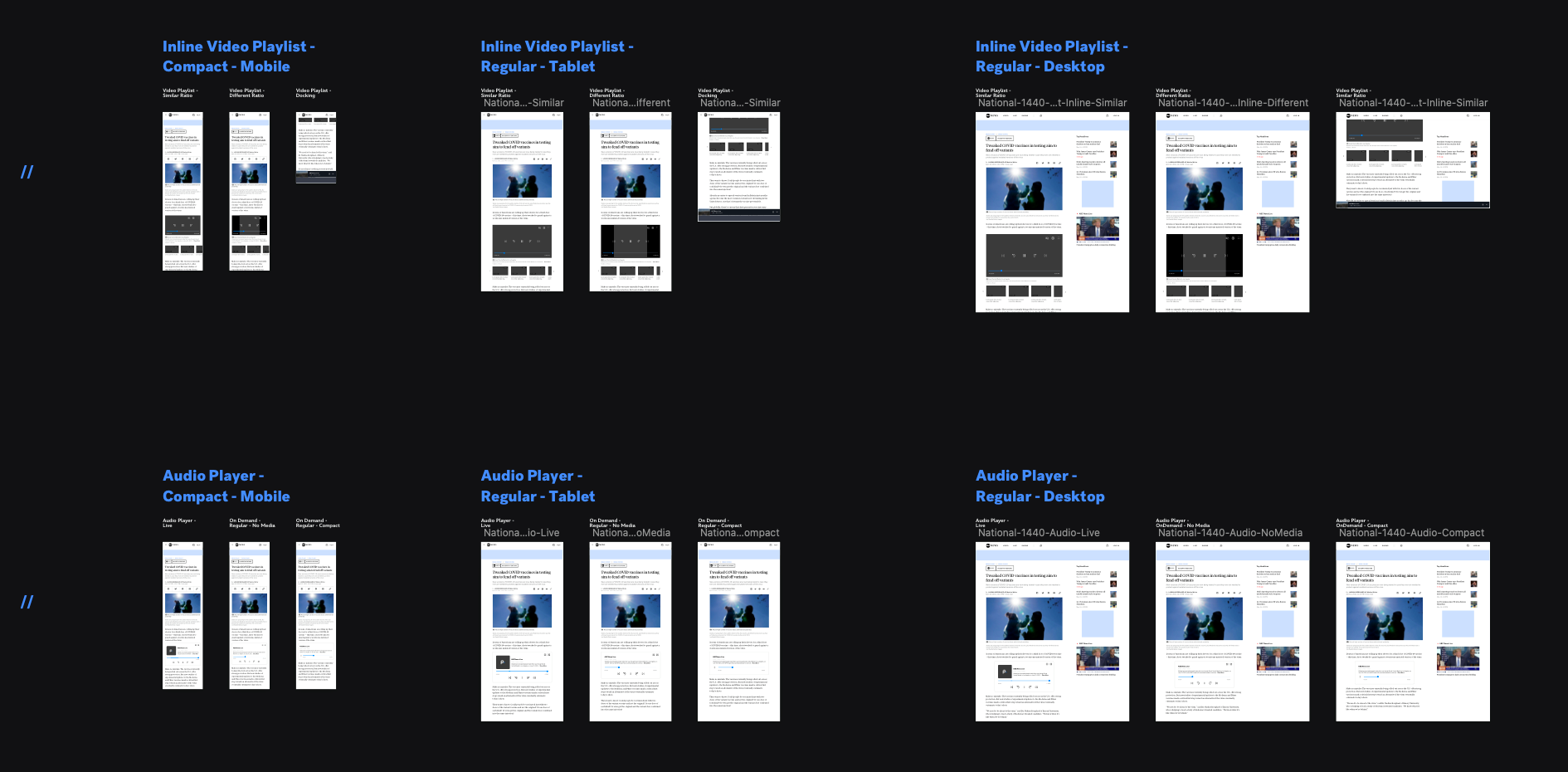
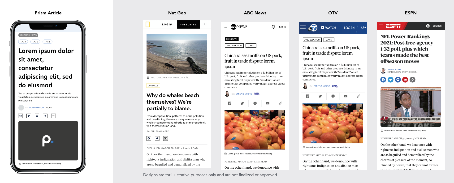
In phase two, we needed to stress test all the components that we designed against each brands article contents. We had to make sure all the brands are able to align with the same consistency as the other. In this phase of the stress testing, we tested ABCNews National, ABCNews Local (OTV), ESPN, GMA, and National Geographic.
Some additional examples of the stress testing for ABCNews National. The next phase of our project is to integrate other Disney brands like Star Wars, Marvel, Avatar, Disney.com, and more!
