STEAM — UI REDESIGN CONCEPT
STEAM APPLICATION
OVERVIEW
Steam is a digital video game application developed by Valve for desktop. Users are able to purchase and play games through this platform.
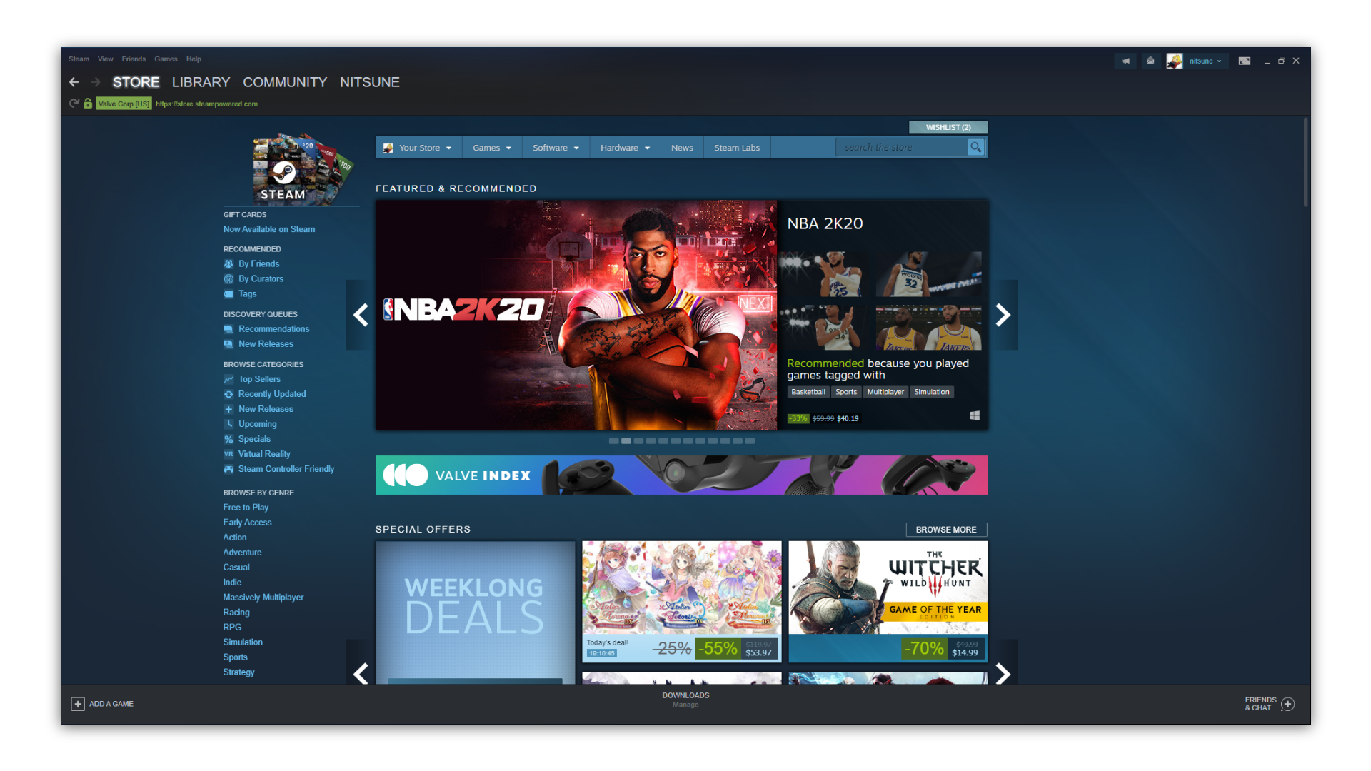
Steam interface design feels outdated and congested with information overload.
For this challenge, I wanted to minimalize the amount of information being preseneted all while keeping a cleaner visual interface.
COMPETITIVE ANALYSIS
Comparing the current steam interface to a few other game clients that I was familar with. This allowed me to gain more insight on what the current market is doing and if there were anything that stood out that could be implemented to steam.
Game clients analyzed:
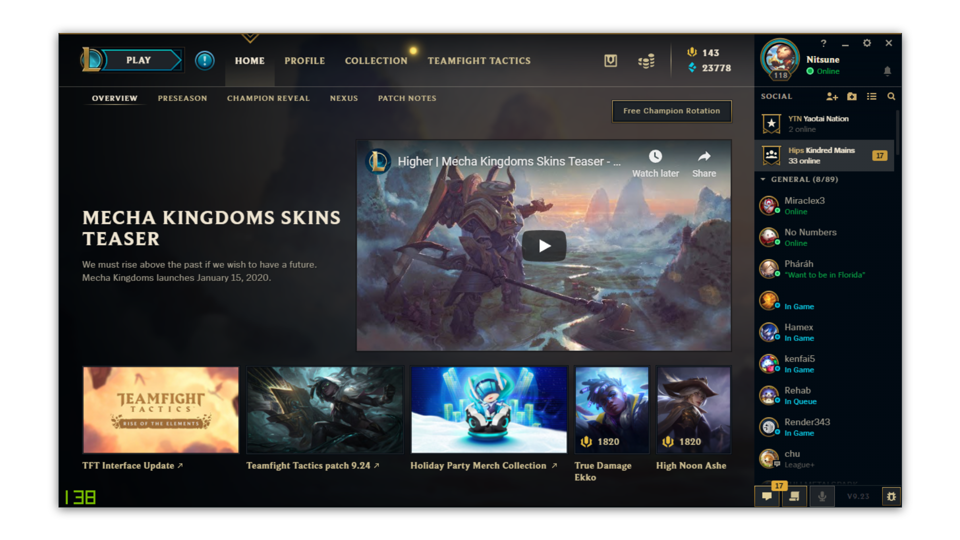
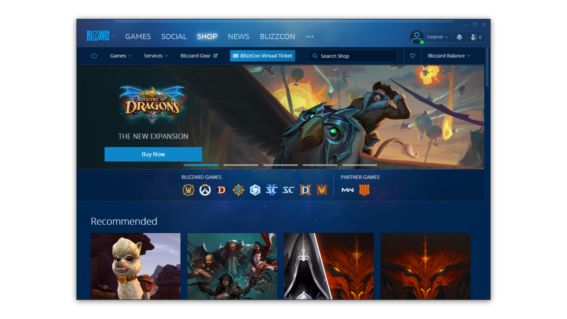
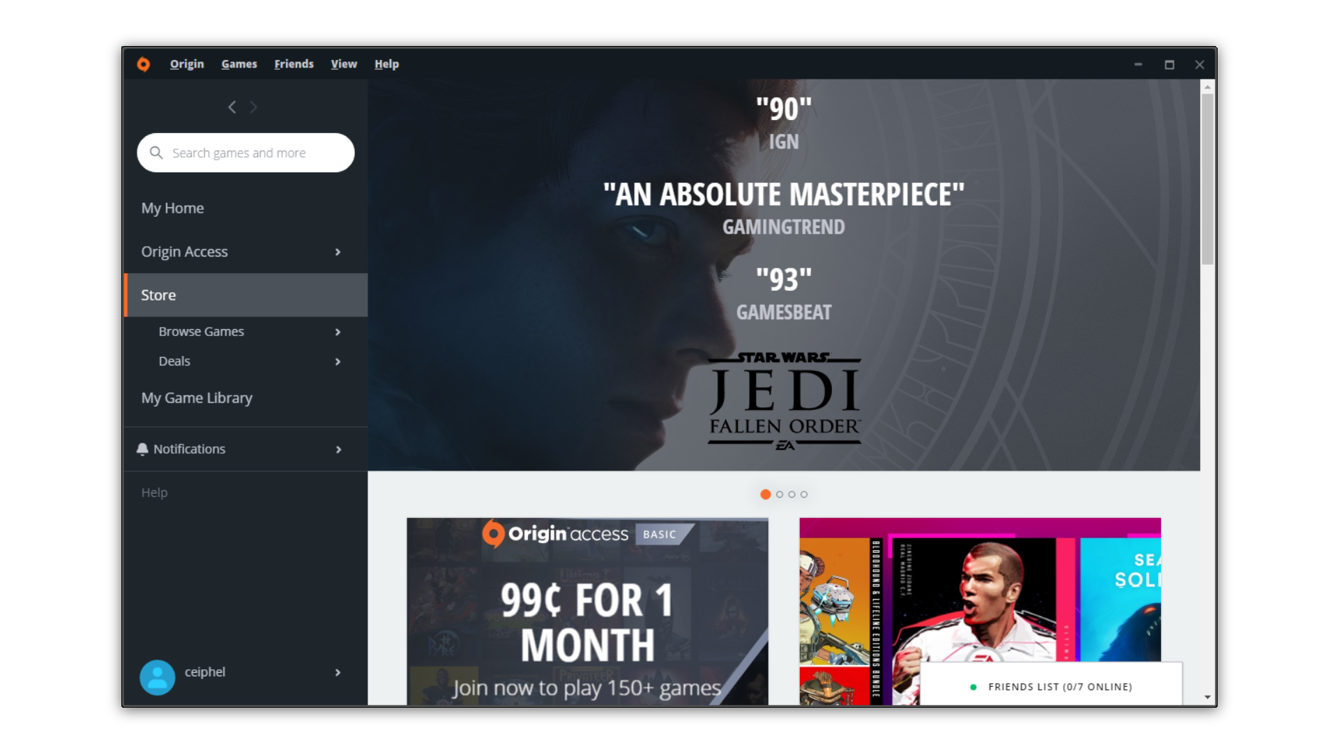
• Riot Games
• Blizzard
• Origin by EA
REDESIGN FOCUS
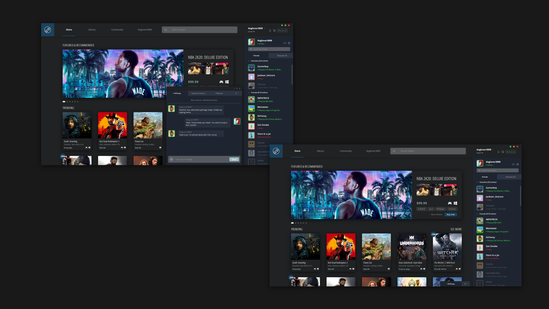
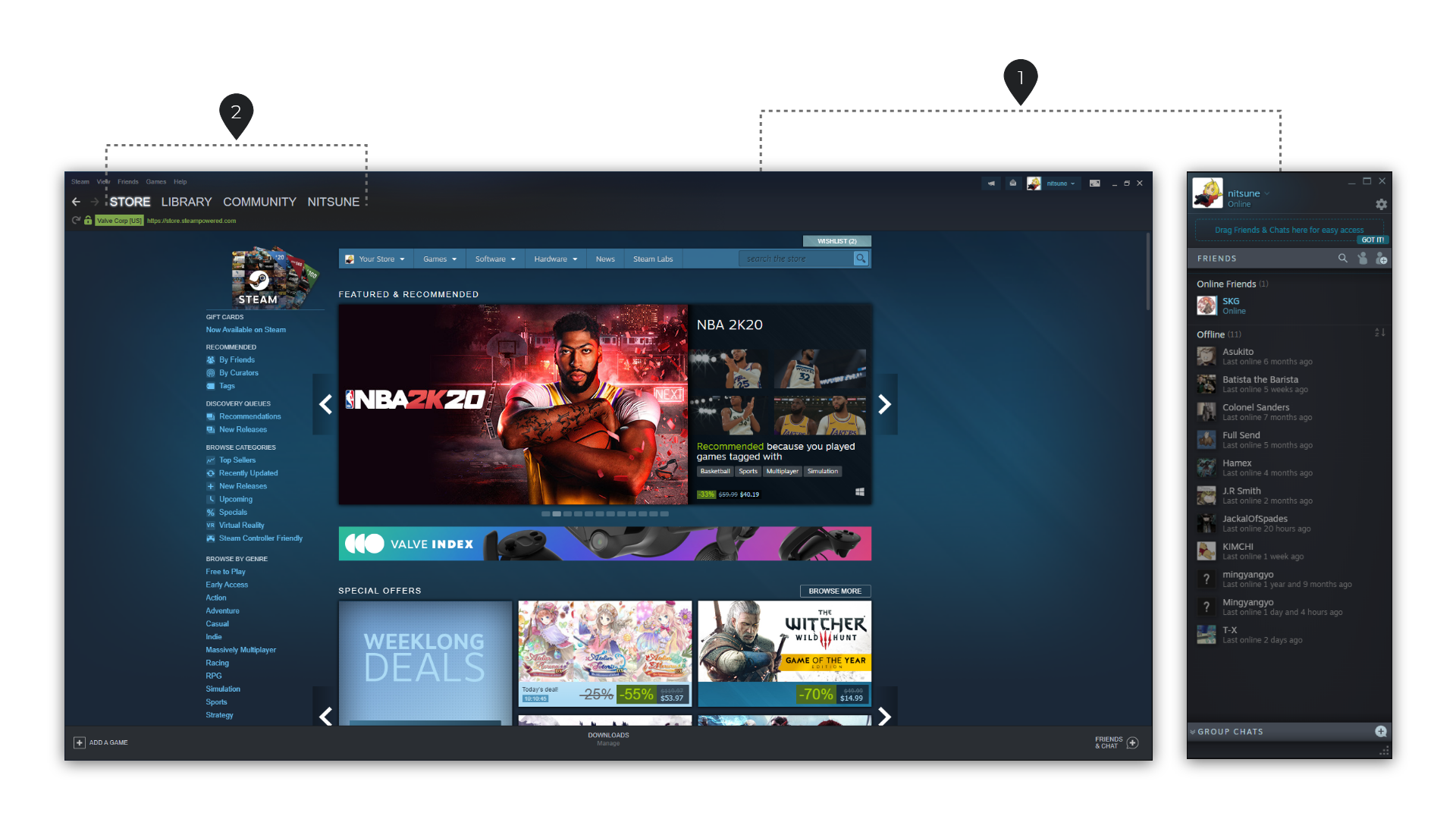
The main features to redesign after analyzing the other game clients were the main application and friend's list.
- Main application and friend list are two separate windows for steam, when a user messages a friend, another window opens. Other clients have the friend list built into the platform.
- Narrowing down the menu to the main four of Steam. Currently, there are at least 3 different sets of menus. This can be confusing to new users and can cause information overload.
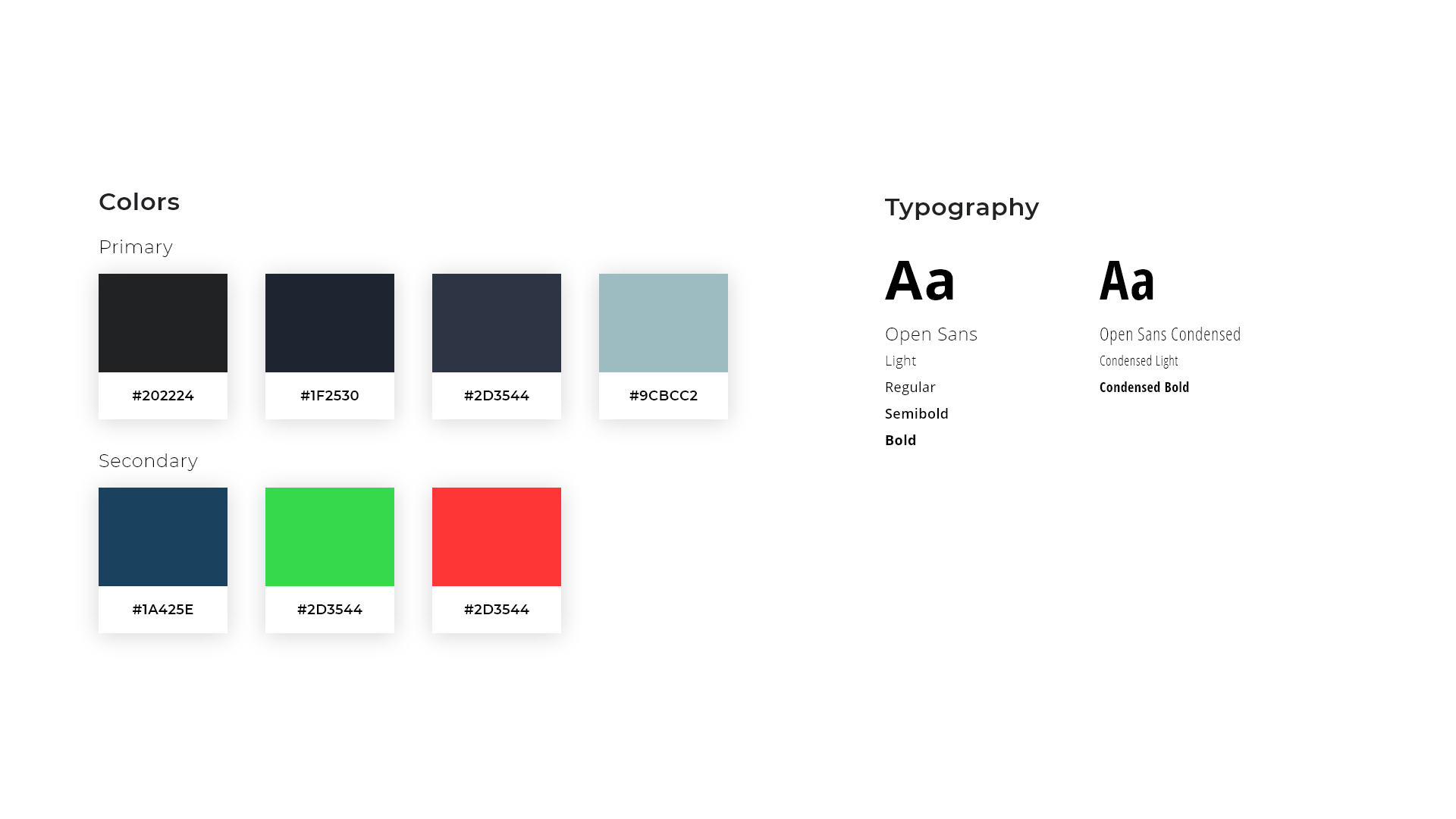
STYLE GUIDE
The primary colors are chosen based on the current colors of the steam brand. By keeping the color the same, users are familiar and feel right at home.
Secondary colors were chosen to help give the interface more contrast from the dark mode.
Font choice were chosen for a clean and readable visual since the interface will have tons of information and colors from game images and videos.
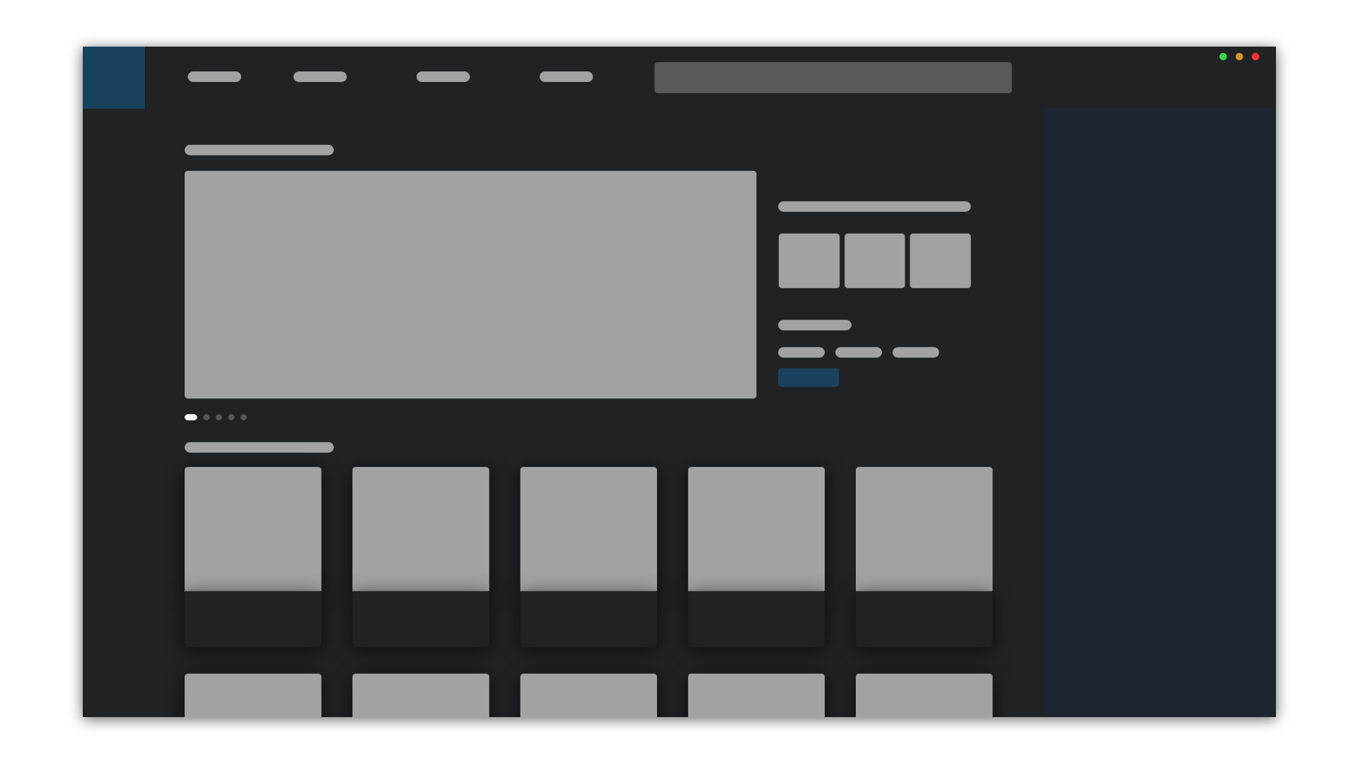
LO-FI WIREFRAME
Designed a simple lo-fi wireframe to get the concept in place.
When designing the final UI concepts, some details were changed to fit the design and experience better.
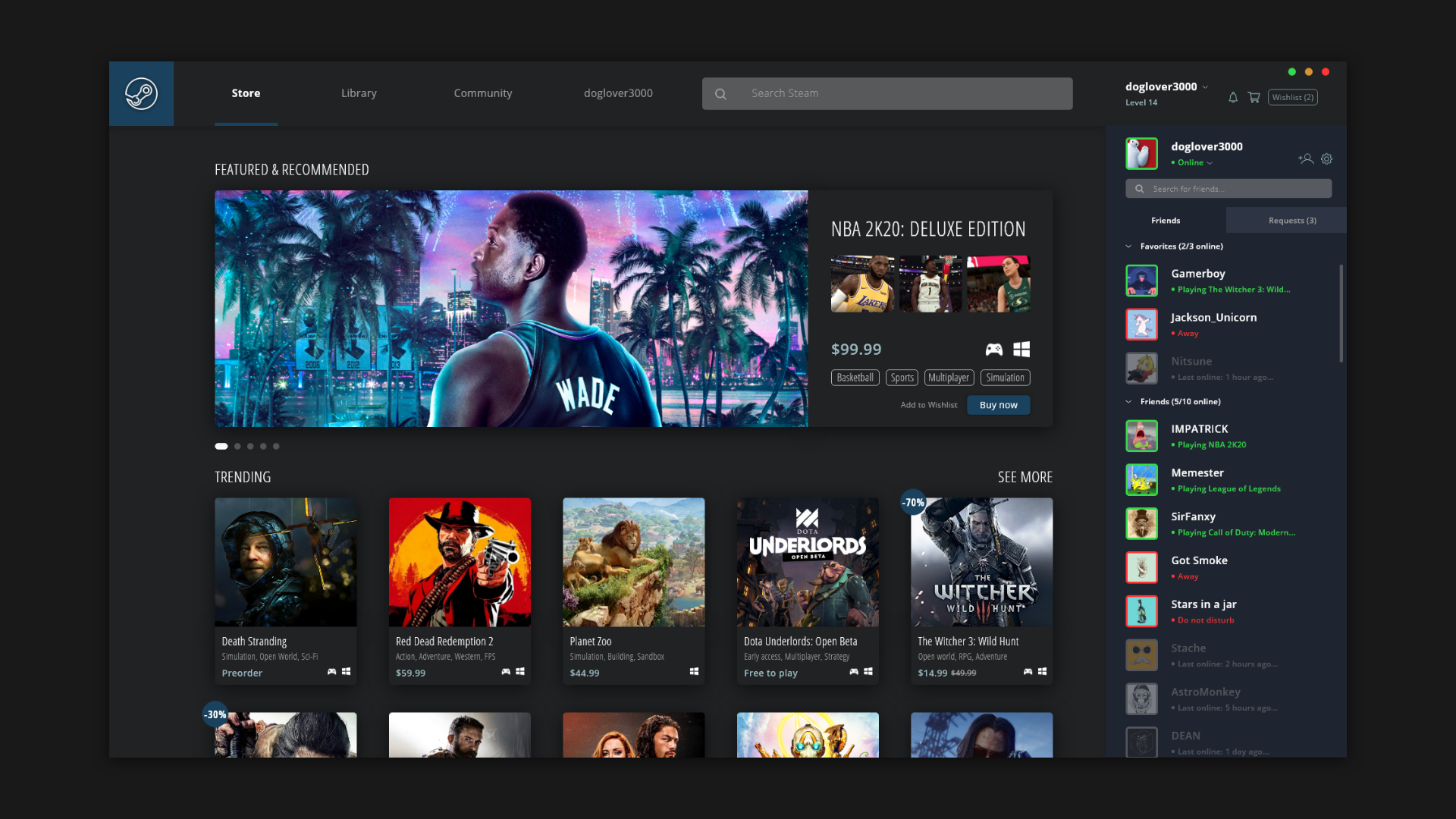
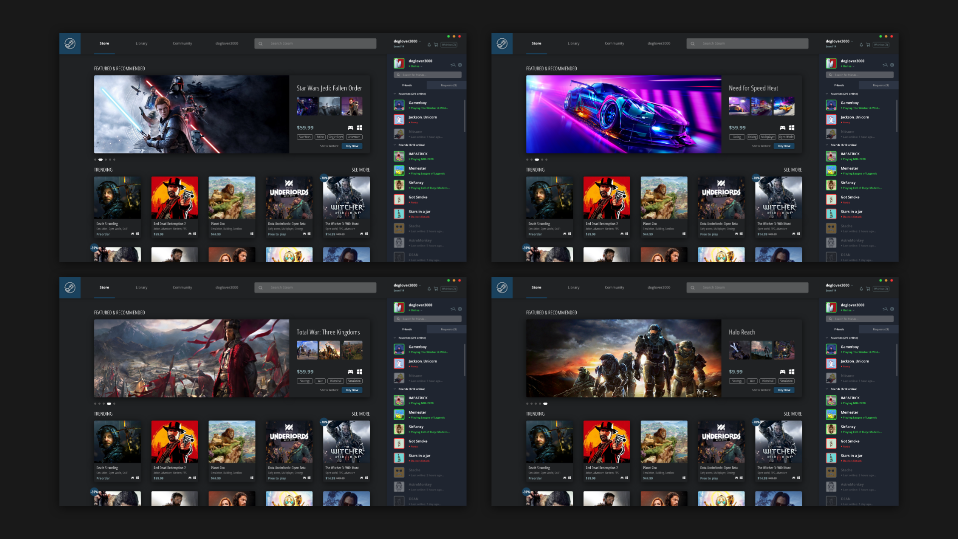
FINAL UI CONCEPTS